|
For this week I had to make a stamp/print making.Now the preparing is very easy. All you have to do is trace/draw your character or design. After that you put a piece of foam behind the drawing and trace real hard. All of that was easy I chose to do mocha from the Sanrio characters. After i finished my drawing I colored the foam with washable marker. I dampen a piece of water color paper then the colored piece of foam on it and press down. This is where everything went wrong.the first one I did the paper was to wet so it didn't work. My other attempt wasn't good either. At first I thought it was the brown marker so I tried red and it still didn't work.If I was to do this again I wouldn't go so deep on the foam.That could be a reason it didn't work. I would've loved to to this until I get it right but I ran out of watercolor paper.
0 Comments
For this week i had to do collage(with construction paper) I thought this was too simple so i generated another style and it was minimalism. In order to incorporate minimalism into this collage I had my little sister pick the 3 colors I could use and she picked beige, red ,and black. Now with these 3 colors I couldn't think of anything to make, but eventually chose to do a sun some clouds and a couple of flowers. A simple but cute scene.. Since I had to keep it as simple as possible I thought this was a decent Idea.I do like this piece but I cant help but to think there is something missing.  So this week was a disaster.I tried to redo week 9. The reason i wanted to redo it is because I know I can do better.The piece is not up to my standards there is multiple things I see wrong with it.For an example the color is patchy and it looks rushed. This time I wanted to draw an object and do Zentangle patterns around it. I decided to draw a vase for the object then i section off parts of the background and drew some Zentangle patterns. None of that was the problem the problem happened after I colored the vase I went to color the background with sharpie and all 3 I had ran out very quickly.Now I was going to go to the store but after failing to convince my mom I decided just to take the L.   For this week I had to draw a zentangle. Zentangle is an art form usually done in black and white it consist of patters and lines within or around an object. I decided to use a star and fill it with zentangle designs. This was easy but it does not look good. The black color pencil i used was patchy and old which gave it a bad look. If I was to do it again i would use a marker to make it less patchy. 
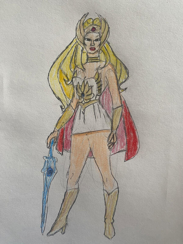
For this week I had to do a painting that involved movement. So i decided to do an album cover. For the album cover I decided to do Igor by Tyler the creator because it is one of my favorite albums. I tried to make the letters look like they were moving. Looking back on this I should've done an album with actual movement. This was hard because I have never done this before. I really like this painting because it took a lot of time to get the shading look right.   For this week the wheel landed on an Emphasis painting. I chose to draw a turtle. To emphasize the turtle I only colored the turtle with watercolor. The other parts I shaded lightly. I drew the turtle on paper and then transferred it to watercolor paper. The one thing I like about my drawing is the color of the turtle shell. It has many different colors making it pop out. The shading on it is okay I should've made it more put together and closer. The one thing I don't like is the dirtiness of the paper. While painting I got my sleeves and hands dirty which got the paper dirty when I tried to paint/shade it. Overall I think I did a good job.   For this week the wheels landed on a Vintage cartoon drawing . I also couldn't color it So with all this in mind I decided to draw steamboat Willie. I decided to do this because when people think of older cartoons he is usually one of the first that comes to mind. This wasn't too hard for me because I am used to drawing am=animals and simple cartoons. The hardest thing about drawing it was the amount of black in the drawing it made things blend in so the lines were harder to see. With this drawing I learned how to keep a drawing plan but not boring 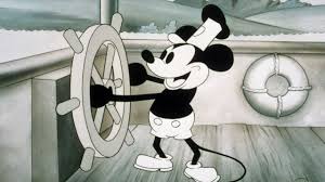   For this week I had to draw an 80s style cartoon and colored. 80s cartoons looked more like comic book strips. To capture that element in my drawing I decided to draw She ra from the classic 80s cartoon he man. This was a struggle for me because I don't usually draw human characters. I felt like I did a decent job with the drawing. One thing I would improve is her face I would make it more realistic to her character
|


 RSS Feed
